
By User Media on
How to structure your homepage content
Recommended section order, what information to prioritize, and how to guide visitors toward the action you want.
Your homepage is not a catalog, it's a conversation
Your homepage has seconds to communicate who you are, what you do, and why they should choose you. The most common mistake is trying to show everything at once: services, history, testimonials, blog, contact... without a clear order. The result is an overwhelmed visitor who leaves without taking action. A well-thought-out structure guides users step by step to the action you want, whether it's contacting you, requesting a quote, or learning more about a specific service.
Common homepage mistakes
Before structuring, identify if your current page has any of these problems:
- Visitors don't understand what you offer within the first 5 seconds.
- Too much information competing for attention without visual hierarchy.
- Action buttons are hidden or confusing.
- Navigation is unclear and users don't know where to go.
- Missing a value proposition that differentiates you from competition.
- Content only talks about you, not how you help the visitor.
- No trust elements like testimonials or case studies.
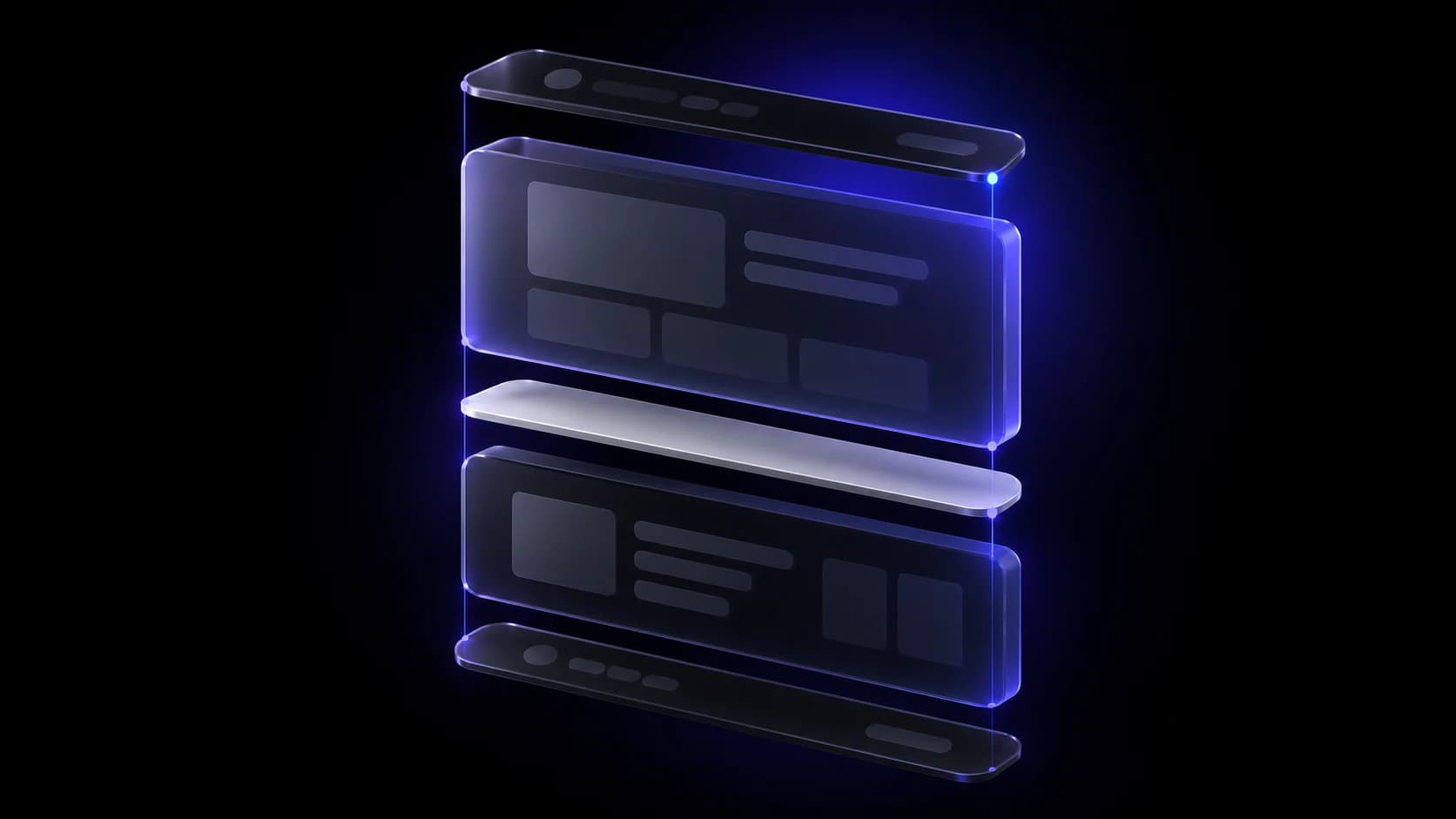
Recommended structure: from top to bottom
- Hero with value proposition: The first block should answer: what you do, for whom, and what benefit they get. Include a clear title, a supporting subtitle, and a main action button. Avoid generic phrases like 'Welcome' or 'We are leaders in...'.
- Problems you solve: Connect with visitors by showing you understand their challenges. A brief list of pain points that your service or product addresses generates immediate identification.
- Main services or solutions: Present your 3-6 most important services with short descriptions and links to detail pages. Don't try to explain everything here; the goal is for users to click to learn more.
- Social proof and trust: Customer testimonials, logos of companies you've worked with, case studies, or certifications. Social proof reduces friction and increases trust.
- Final call to action: Close with a clear CTA that reinforces the main action. It can be the same as the hero or a variation. Visitors who made it this far are interested; make the next step easy.
Your value proposition: the most important element
The value proposition is the phrase that explains why someone should choose you over the competition. It's not an advertising slogan or a description of what you do. It's the combination of: what you offer + to whom + what result they get + why you're different. For example: 'We design websites that convert visitors into customers for professional service companies, combining SEO strategy and conversion-centered design.' Spend time defining it before designing anything.
What NOT to put on your homepage
The homepage is not the place for: your complete history (that goes in 'About'), extensive descriptions of each service (that goes in individual pages), all your blog articles (a summary of the most recent is enough), or information that only interests existing customers. Each element must earn its place by answering: does this help new visitors understand what we do and why they should care?
Frequently asked questions about homepage structure
How many sections should a homepage have?
Between 5 and 8 well-defined sections is a reasonable range. More important than quantity is that each section has a clear purpose and guides toward action. A short but effective page beats a long and confusing one.
Should I include prices on the homepage?
It depends on your business model. If you sell products with fixed prices, showing them generates transparency. If you offer customized services, it's better to invite quote requests and explain value before discussing price.
How long should hero text be?
The main title should be between 6 and 12 words. The subtitle can extend to 15-25 words. If you need more text to explain your proposition, it's probably too complex or not well defined.
Should I use image sliders or carousels?
Generally no. Studies show users rarely interact with slides after the first one. It's better to use a striking static image or a short video that communicates your main message.
How do I know if my structure is working?
Measure time on page, bounce rate, and clicks on your main CTAs. If users leave quickly or don't click anything, the structure or content needs adjustments.
Need help reorganizing your homepage?
We can analyze your current page and propose an optimized structure to convert more visitors into customers. Request analysis