
By User Media on
Design mockups: approve the look; a prototype tests whether it works
A mockup shows how your website, package, or ad will look; to know whether a button, a form, or a print run works, you have to test it.
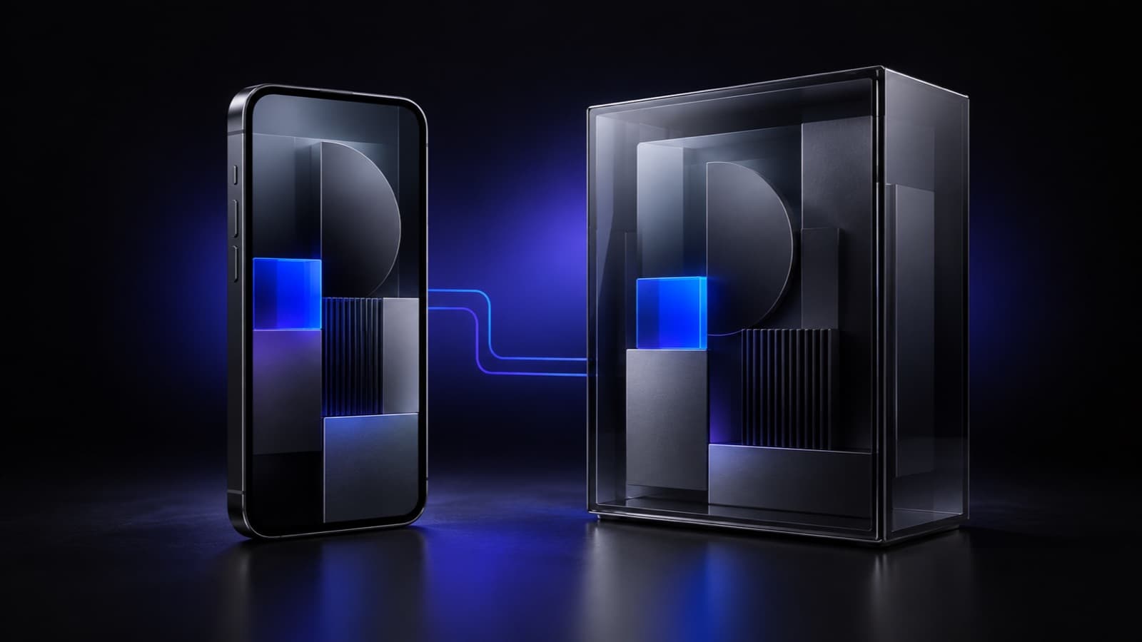
A static mockup can look finished even when its buttons do not work. A design mockup is a realistic image of a proposal in its setting—a screen, package, garment, or ad—that helps you judge how it looks and reads before production. What it cannot prove on its own is that a customer can complete the journey.
What is a design mockup, and how does it differ from a prototype?
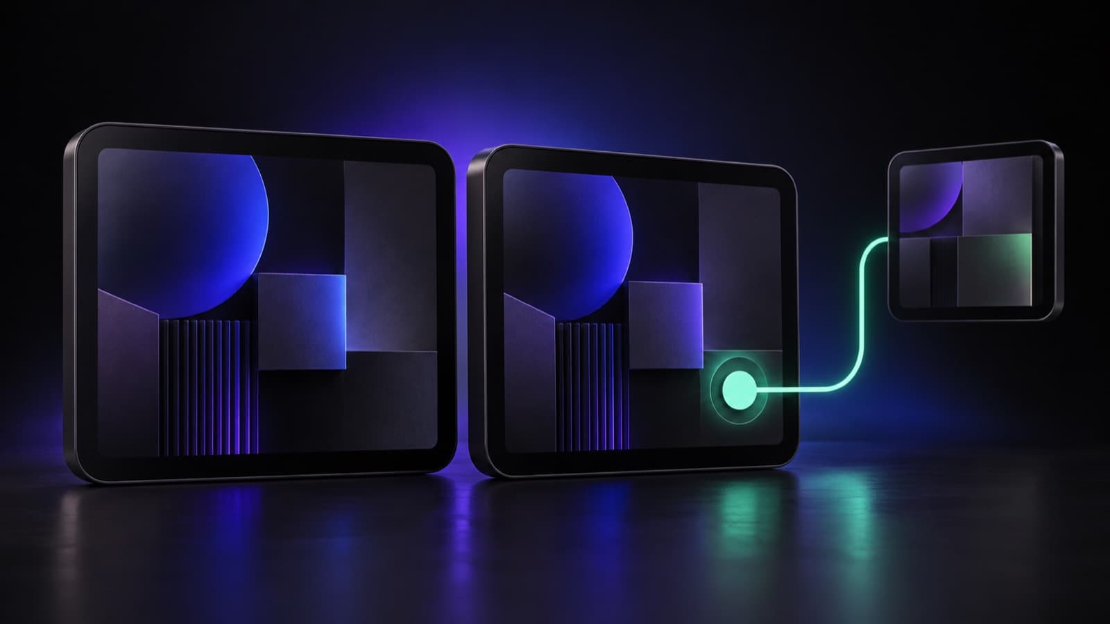
A mockup shows how a proposal looks; a prototype lets people try it. That distinction matters when approving a website or app: a composition can have highly realistic images, colors, and content while remaining a fixed image.
Visual fidelity and interactivity are separate qualities of a design proposal. Nielsen Norman Group explains that a prototype can vary independently in visuals, content, and interaction. When you need to complete a form or compare screens, review a clickable path rather than just polished layouts.
What can a mockup validate before you approve a brand?
A strong mockup helps validate hierarchy, context, and brand consistency. It can show whether the name, benefit, and call to action stand out in the place where they will appear. It also reveals when a photograph, texture, or color takes too much room from the message.
The right context shifts the conversation from taste to business criteria. On a food pouch, the front view helps assess whether the name, variety, and necessary information compete. Final color, material, finishes, and tolerances still need supplier specifications and tests before printing.
How should you review a web design mockup on phone and desktop?
Complete web approval requires both phone and desktop views. Google indexes and ranks using a site’s mobile content as crawled by its smartphone agent, according to Google Search Central. That makes a desktop-only layout insufficient for approving a homepage.
A mobile composition may need a different crop to keep the subject visible. A horizontal image that works beside copy may need a vertical version on a phone; MDN Web Docs documents how picture, srcset, and sizes can provide those alternatives. In the landing pages we design, the promise and action need to survive the change in space.
| View | What must remain | Test next |
|---|---|---|
| Desktop | Message and action | Clickable path |
| Phone | Benefit stays visible | Size and keyboard |
| Package | Name and variety | Supplier proof |
Which mockup works for packaging, apparel, or graphic design?
The best format reproduces the decision your customer must make. For packaging, a front view plus any relevant folds or sides is useful. For apparel, the layout should show the artwork’s placement and scale; for a graphic piece, the final format and crop lead the review.
An ad needs a mockup for each placement when the crop changes. A campaign applied to a post and paid placement lets you check hierarchy, brand presence, and cropping. Platform preview and user testing then clarify whether the link, copy, and destination work; that connects naturally to a Meta Ads strategy.
How does a graphic proposal translate into an ad or web page?
A proposal reads better when every format keeps one clear priority. In a vertical ad, the benefit can lead at the top, the product can occupy the center, and the action can remain clear at the end; on a page, the first screen organizes promise, evidence, and next step before details.
Contrast keeps a message readable when type and background compete. For normal text and images of text, the AA level of the accessibility guidelines from W3C WAI calls for at least 4.5:1; large text needs 3:1, with exceptions. As we explain in brand color palette, contrast follows function, not just identity.
How can you avoid approving a proposal just because it looks good?
A sound approval separates what an image reveals from what needs testing. A layout can confirm that an idea fits and reads, but it does not measure load speed, accessibility, or conversions. The Largest Contentful Paint (LCP) metric measures how long the largest text or image on screen takes to appear; web.dev recommends 2.5 seconds or less for at least 75% of visits.
Pre-launch review turns an attractive image into a verifiable decision. Before building, it helps to check contrast, sizes, and real tasks. WCAG 2.2 asks that buttons and links people click or tap measure at least 24 by 24 CSS pixels, the unit browsers use to draw the page, with exceptions; W3C WAI explains the criterion.
- Confirm that the support, format, and context match the real use.
- Check that the name, benefit, and action stand out at first glance.
- Compare phone and desktop versions whenever the piece is for the web.
- Measure contrast and control size before the interface is built.
- Request a clickable prototype for tasks, forms, or purchase flows.
- Request supplier proofs when color, material, or finish matters.
Frequently asked questions about design mockups
Can a packaging mockup tell me exactly how it will print?
A mockup anticipates composition and scale, while production needs further validation. It can show whether the front prioritizes the name and variety or whether information becomes too small. Final color, material, finishes, and tolerances depend on the specifications and proofs completed by the supplier.
Does a website mockup guarantee that buttons and forms will work?
A static screen does not confirm that a web task can be completed. Forms, states, errors, and purchase steps require a clickable prototype or the implemented site. Interaction must also be possible by keyboard, as W3C WAI’s keyboard criterion establishes.
Why does a proposal look different from desktop to phone?
Available width forces text, images, and controls to reorganize on each screen. A crop that keeps a product visible on desktop can hide it on a phone, and a row can become a column. That is why a web proposal is approved by comparing compositions rather than shrinking one screenshot.
When should you ask for a clickable prototype instead of another mockup?
A clickable prototype is useful when the decision depends on an action or journey. It fits tests of a form, checkout, menu, or movement between screens. Another mockup adds visual context; a prototype lets you observe whether someone understands and completes the intended task.
Need a proposal your team can approve with confidence?
At User Media, we turn brand, ad, and web ideas into clear proposals and define what should be tested before building or production. Let’s talk about your project.